2014 has only recently begun, meaning it’s time for developers and business owners to tweak their game plan for the year. In the new year, some businesses may want a new look for their company, which could mean a logo update or a redesigned website. If you’re looking to change your website, you’re in luck. In 2013, many businesses came up with spectacular website designs you can use for inspiration.
In general, popular web designs are sleeker and smarter than ever before. They are colorful and visually stimulating without looking too busy and have intuitive navigation. Now more than ever websites are also more about the user experience — they’re nice to look at, don’t waste space and give you the information you need without the extra fluff. Here a few examples of the best web designs of 2013.
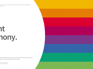
Coloured Lines

This website is for an Australian VOIP carrier. The site is simple yet elegant, and best of all it incorporates its logo and brand into the overall design. Coloured Lines’s logo is just that — a series of colored lines. The site’s homepage plays on this theme. The right hand side of the page only consists of a series of colored lines, each of which represents a different part of the website.
Brave People

Brave People is a branding company, so it makes sense that the company’s website does an excellent job with its own branding. When you enter the site, you see one large image with a caption in the center. The site scrolls through several different images, and each of them is actually an example of a branding campaign. Right off the bat this gives you a great idea of what the company does and what the quality of its work is like. When you scroll down you see more information about the company. There are even a few pictures of employees, which gives a personal touch by helping customers put the name to the face.
Brooklyn Soap Company

Similar to Brave People, Brooklyn Soap Company is another site that’s based on a large central image with a caption in the center. This image also does a great job of branding — the central image is a picture of the East River and the Brooklyn Bridge flanked by a few warehouse. This gives the brand a homegrown, local feel since it shows you where the brand comes from. Buying the soap is like taking a little bottle of Brooklyn with you wherever you go.
Church of the Atom

This site is for a Swedish brewing company, and it features stellar navigation and branding. The top of the page has the title and a single caption, Nanostyle Wasteland Brewing, which tells you pretty much everything you need to know about the company in just a few words. The navigation of the site is very creative, but makes a lot of sense. At the top of the homepage, there are a number of colored triangles. Each one of them corresponds to a beer the company sells, and even better, the triangle matches the design of the bottle.
LOT 1038

LOT 1038 is a European home brand company based in the Caribbean. The site does a great job of marketing its products and creating a comfortable island feel. It has a bold yet simple logo in the center of the page, capturing users’ attention. Right below, it flashes through sample designs the company has helped create. Whether you’re on vacation or need to spend time at a rehab center, these are the kinds of designs that immediately make you feel at home and relaxed. Below the image reel, there is more information about the kinds of products and services LOT 1038 offers.
12 Keys Rehab

This is another site that immediately makes you feel relaxed, which makes sense considering it’s for a rehab center. 12 Keys Rehab’s site made the list for a few reasons. They have a great content strategy on their blog that enhances that part of their design and because of their simple and effective navigation. For a small business website, it hits every checkmark for design, functionality and SEO.
Overall, these sites have a few things in common. They’re easy to navigate, reach out to their audience and attempt to make their sites interesting. They all do this even as they maintain a stylish and sleek look, which is an excellent goal for web design in 2014.
Alicia Lawrence is a content coordinator for WebpageFX. She enjoys helping her clients boost conversions through business development. When not at work, you can find Alicia cooking up a storm in her apple-red kitchen or blogging about SEO strategies.
