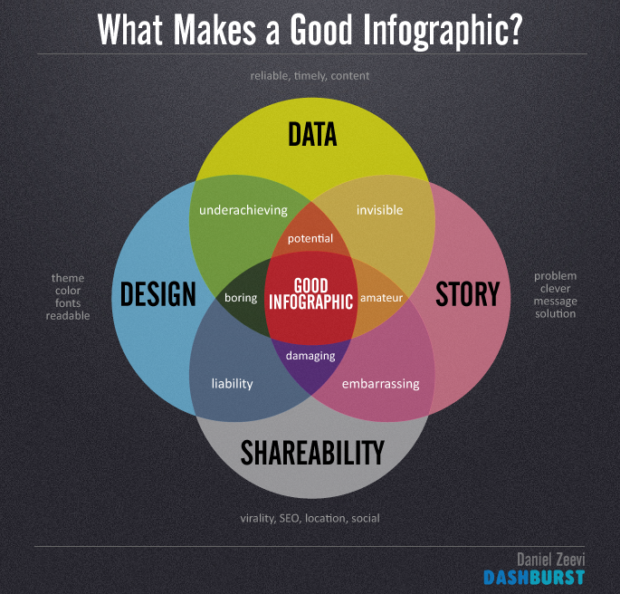
Infographics are visualizations of data that can help audiences quickly grasp complex sets of ideas. The key to a good infographic design is to find interesting and reliable data, then come up with an awesome blueprint and visual story to deliver the underlying message. Infographics have become an extremely popular form of content marketing that can reward a site with quality backlinks and tons of new traffic, but what separates the really good infographics from the rest?

1. Data
The data gathered for an infographic should be from reputable sources and represent the latest statistics available at the time. You can have a visually stunning infographic that gets a ton of shares, but if the integrity of your data is in question so will be your infographic eventually. The unwritten code of infographic design is to always use honest and accurate information while citing your references.
- Reliable
- Timely
- Content
The key is to then put the data together in a meaningful way to help convey that information quickly like this viral infographic by Go-Globe.

2. Story
A story is a chain of events that takes you from one destination to another and when it arrives at is end should fulfill it’s reason for being told. The key to a good infographic is to draw an audience in with a captivating story or message that does just that.
- State the Problem or Issue
- Time Frame
- Deliver Message
- Solution
This infographic by Frugal Dad paints the tale of how social consumers are now standing up to brands via social media.

3. Design
The design of an infographic involves visually presenting the data and story in a beautiful and appealing way. A good infographic places careful consideration on finding the right color scheme, readable fonts, cool graphics, icons, characters and finding clever ways to illustrate digestible information.
- Color theme and structure
- Fonts
- Graphics
- Appearance
A great design can draw attention to any infographic like this gem from Udemy and Columnn Five Media.

4. Shareability
The final component to a good infographic is shareability. You could have the coolest design ever but if no one sees it could be a waste of significant time and resources. Fortunately even with a minimal online following, great content always seems to get discovered eventually.
- Relevance
- Interestingness
- Web optimization and SEO
- Social media
This Steve Jobs tribute by Infographic World won best infographic of 2011 with effective story telling and timing.

Putting it all together
You can find good infographics at the intersection of reliable data, compelling story telling, creative design and viral shareability. Have you seen any stellar infographics recently that would qualify? Or what about a design you felt was less than par? Feel free to share some great examples in the comments below.

