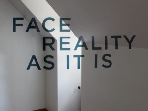
 Everything we see is a perspective and not the actual truth. And if you’re familiar with anamorphic typography, you’ll quickly realize how we all look at things a little differently, depending on the angle we’re coming from. So designer Thomas Quinn has created a rather moving anamorphic type piece that illustrates this also asking everyone to “Face Reality as it Is,” of course from your perspective. Quinn’s piece was crafted in a room above his parent’s garage, and given the tight quarters, it happens to make a perfect place to see the complexity of the design across the wall from different vantage points and how it all comes together from the right view.
Face Reality as it Is
Quinn also recently did a new anamorphic typography installation for the Chicago Design Museum, which is a pop-up museum that set up shop downtown Chicago back in June 2013.
Quinn said about the experimental type:
Anamorphic typography is a spatial experience in which an arrangement of letters look perfectly set from a single point within a space, while looking wildly distorted from any other perspective.
Everything We See is a Perspective Not the Truth
via The Fox Is Black


