
Using images from the NASA/U.S. Geological Survey Landsat 7 satellite, researchers from the University of Maryland and Google were able to map how the world’s forests have changed since 2000. The enormous computing feat produced the world’s first highly zoomable global deforestation map, enabling us to see where deforestation is taking place at the fastest rate and how much forest cover has been removed over time. Though the methods behind the scientists’ computing are impressive, the results are quite depressing.
The team processed over 650,000 images from the Landsat 7 satellite, amounting to 20 terapixels of data. Using one million CPU-core hours on 10,000 computers in parallel the team characterized tree cover change between the years 2000 and 2012. What took Google Earth Engine a matter of days to complete would have taken a single computer 15 years to perform, according to Matt Hansen, Peter Potapov, Rebecca Moore and Matt Hancher of the collaborative research team. Using this data, the team calculated that 2.3 million square kilometers of forest was lost between 2000 and 2012, while only 0.8 million square kilometers was gained. That’s a net loss of 1.8 million square kilometers, an area of land comparable in size to the entire state of Alaska!
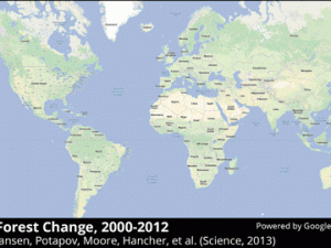
Reading the Maps

The map displays tree coverage, which is defined as all vegetation taller than 5m in height. On the map, red indicates tree loss, blue indicates gain, green indicates the extent of coverage and purple indicates both tree loss and gain. Using this coding you can see deforestation that occurred for both natural and human causes, including the tornado in Tuscaloosa, Alabama (above, trace the tornado’s path in red), the forest fires in Yakutsk, Russia and more.
Quantifying Deforestation for the First Time
The researchers found that tropical forest loss is increasing with an average of 2,101 additional square kilometers of forest loss per year. Though deforestation in Brazil has been curbed, forest loss has increased in countries like Indonesia, Malaysia, Tanzania, Angola, Peru and Paraguay. For example, see the timelapse GIF below of forest loss in Paraguay, which has experienced rapid deforestation as people spring to develop cattle ranches:

Though it was previously impossible to obtain deforestation information for certain parts of the world, these maps bring to light changes in forest cover everywhere. The researchers hope that governments can use these maps to understand how and where deforestation is taking place in their countries. They write:
The results can be used as an initial reference for countries lacking such information, as a spur to capacity building in such countries, and as a basis of comparison in evolving national forest monitoring methods. Additionally, we hope it will enable further science investigations ranging from the evaluation of the integrity of protected areas to the economic drivers of deforestation to carbon cycle modeling.”
Putting Local Forest Change into a Global Context
The Earth is one giant ecosystem and, though it might not seem like an environmental change in South America could affect countries halfway around the globe, everyone is linked through the climate. As Megan Treacy at TreeHugger points out, this world deforestation map helps us understand how deforestation in one part of the world affects others. “It’s groundbreaking not just because of the high resolution,” she writes, “but also because it’s the first tool to show forest cover and loss on a global scale – you can see the effects of what’s happening locally in a global context.” Hopefully governments, scientists, activists and educators can use this map to help people visualize the drastic changes that have taken place in environments around the world over the past decade, and use the information as a basis for putting sustainable measures into place that prevent further damage to the world’s forests and eradicate the economic drivers behind deforestation.
Before you go, you might find it interesting to hear Hansen, one of the University of Maryland researchers who led the project, narrate the timelapse sections of the map and their significance on a computational and environmental scale:
What does the map tell you about global deforestation?


I would like to see it compared to a longer time frame. I’ve been told by professors in natural science classes there are significantly more trees, for example, in the United States than when the pioneers came here in the 1600s.